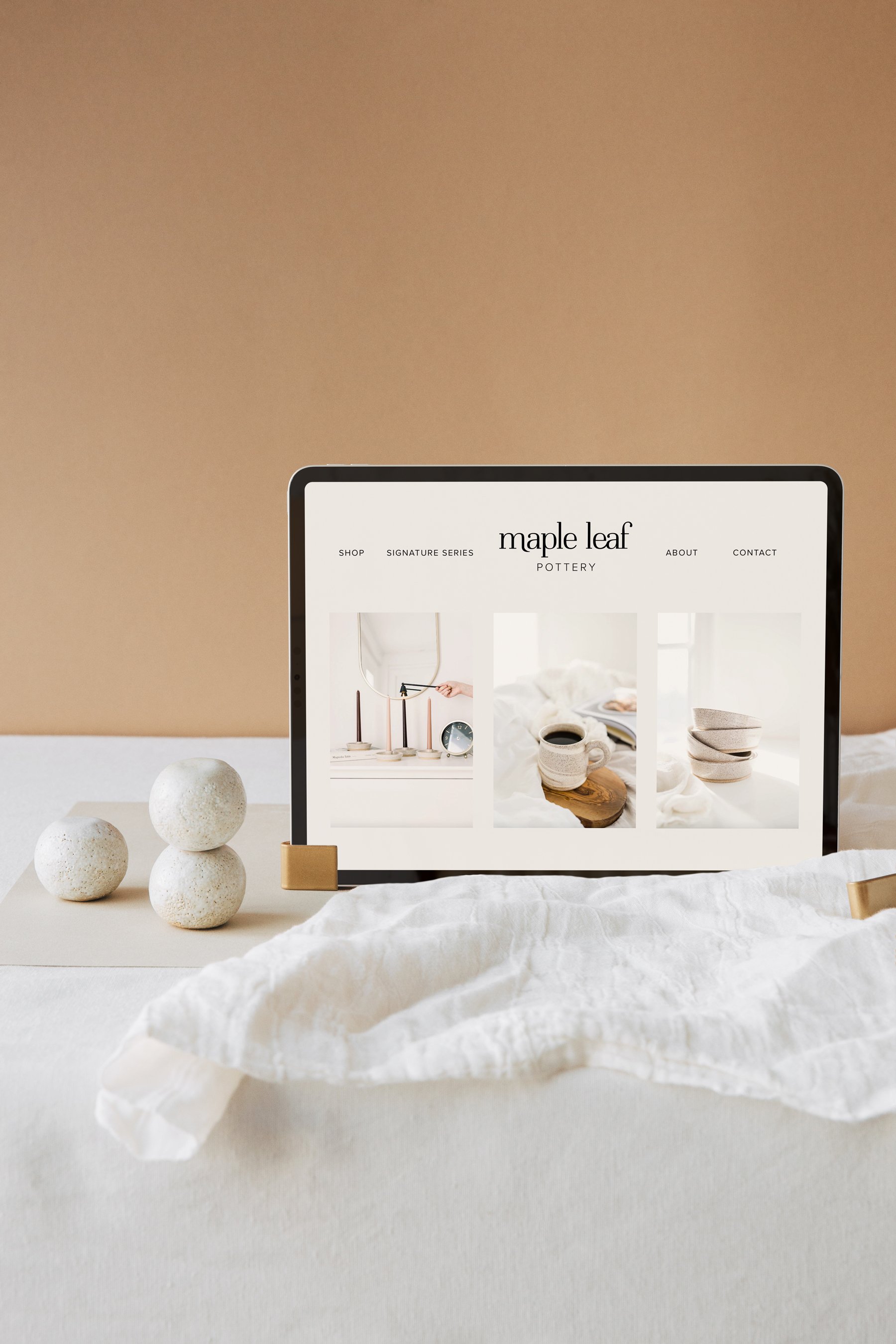
Maple Leaf Pottery
brand identity – illustration
Liz of Maple Leaf Pottery loves what she does.
She wakes up in the morning, stretches (underneath a sleeping cat or two), and smiles remembering that she gets to do what she loves for a living. Not only that, but other people love what she makes too!
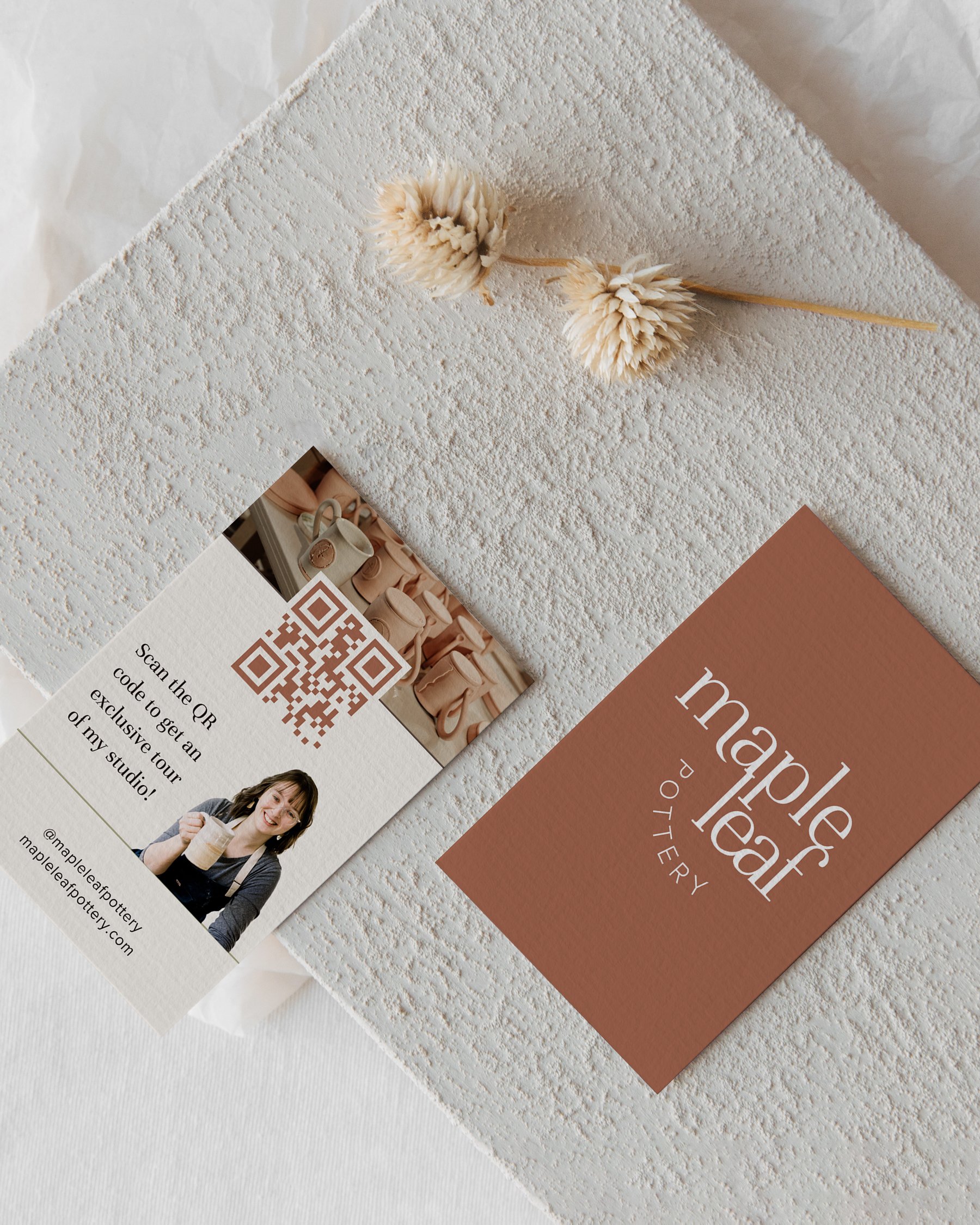
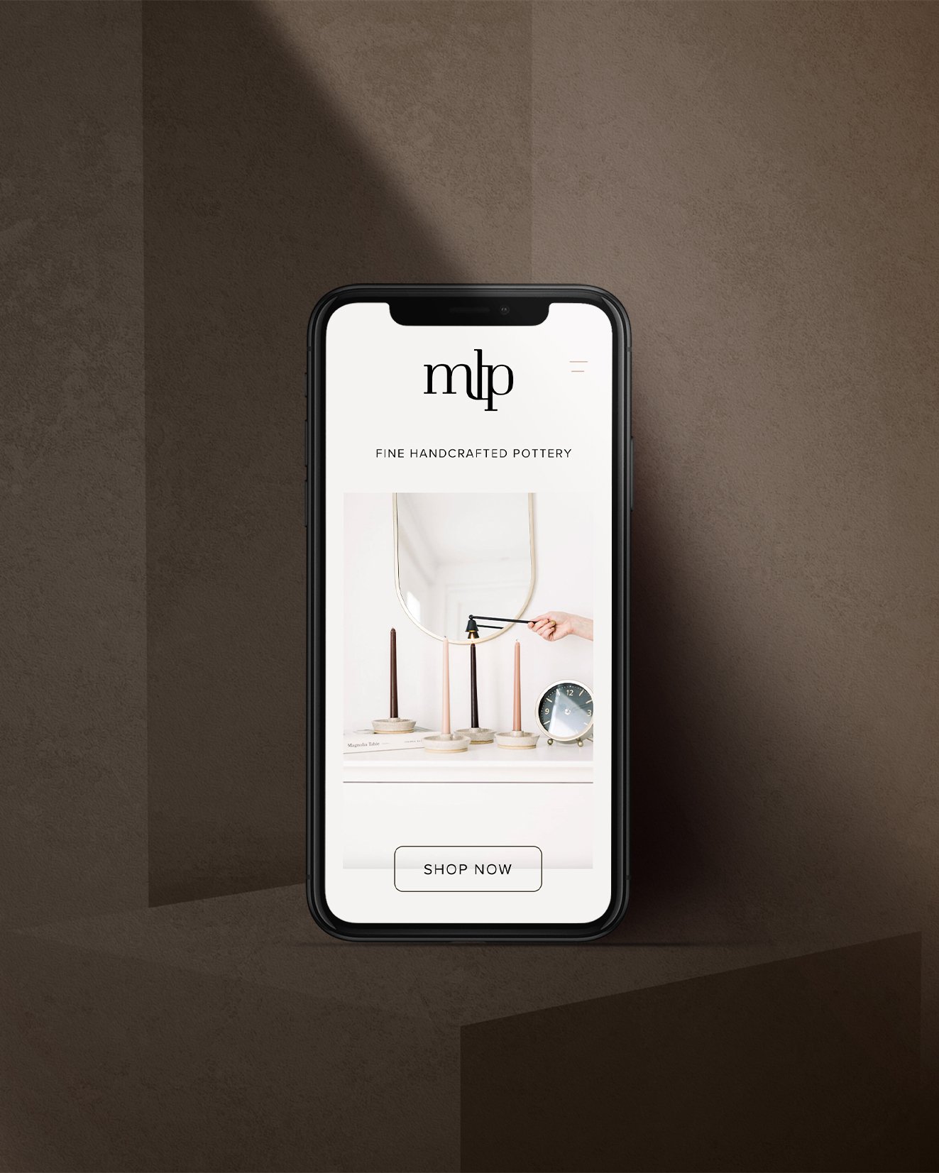
Reaching more of those people was one of Liz’s goals when it came to a brand update. As her pottery work evolved and her business grew, so did her audience, until she realized that she needed to make the important investment in a brand that would reach more of that audience. This meant changing up the logo, colors, fonts, and even adding few fun illustrations.
Enter: me! Hey. 👋🏼
The Brief
Liz was recognizing that she was taking her skills and products more seriously. Her target audience has changed and evolved, and after reflecting on that evolvement, Liz was able to take the next step into a more refined, tight, and bold logo. Together, we created a brand that feels elegant without taking away from Liz’s approachable, quirky tone.
Each element of Liz’s brand needed to work together to become something truly unique and elevated. From custom illustrations to a new font suite, we designed a brand that would help Liz step into a new season of business.
Let’s dive into what we created with this amazing pottery brand!


