Farm & Fare
BRAND IDENTITY – ILLUSTRATION – PRINT COLLATERAL
Introducing Farm & Fare, a fictional restaurant brand for people who appreciate the simple things in life. 🍽
Something I've been wanting to do for some time is design a brand concept for a farm-to-table restaurant that produces limited seasonal menus and offers limited seating. Each meal would be prepared from ingredients grown on the connected farm, or sourced from another local farm, and the restaurant would be open one or two nights per week. Retirement dream, perhaps? 😅
The logo itself I wanted to be extremely imperfect, with a handwritten element that joined into a traditional serif font. I scribbled ‘farm’ within Procreate until I was happy with the result, and played around with some different ampersand techniques as well.
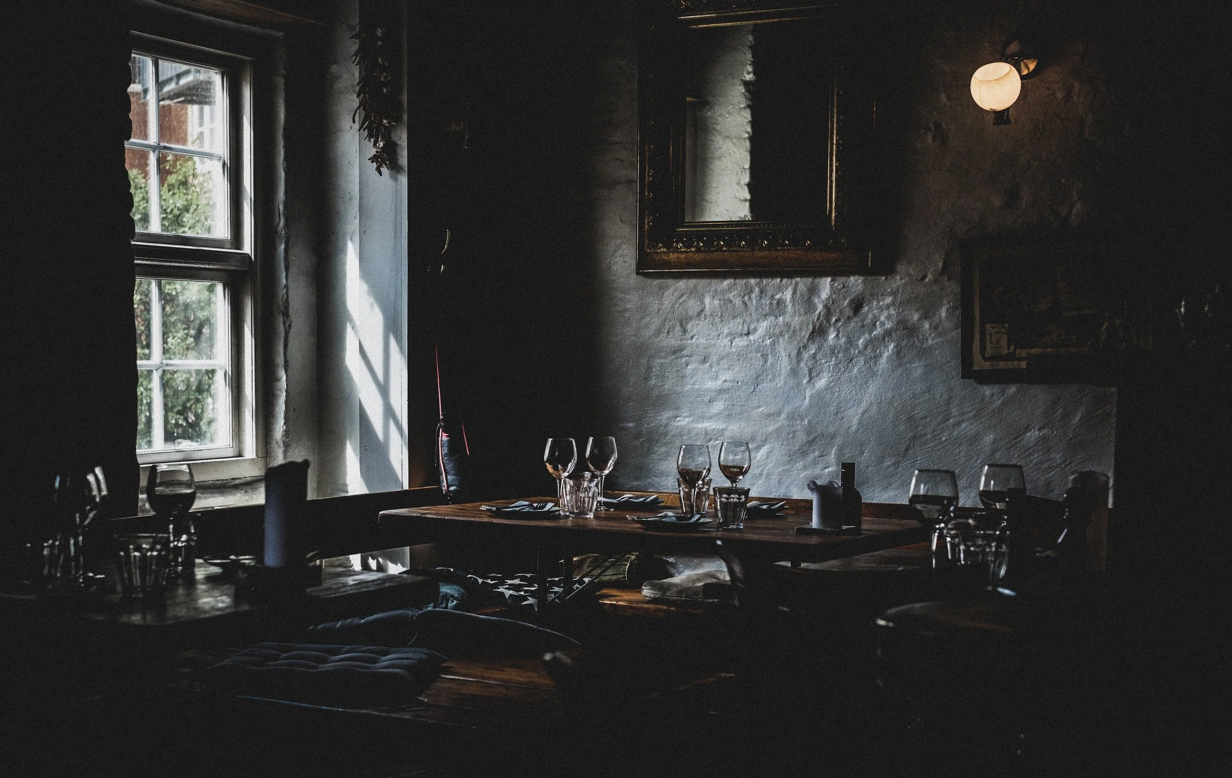
From website to menu to pattern to advertisements, I wanted to showcase this brand in a variety of different mock-ups. The restaurant space would be very warm and inviting, with a long wooden table for family-style eating, moody lighting, and dark wood textures.
For the menu, I wanted to include some rustic little food illustrations, so I got out my trusty sketch pad and drew some hearty bread, sprigs of rosemary, and a little fork & knife set.
This brand was truly such a delight to create! Every now and then, I get the urge to create something that’s not for anyone else necessarily, just for my own joy. Farm & Fare is a restaurant that sadly does not exist, but maybe someday it will. This helped stretch my illustration skills and developed an idea that’s been on my mind for a while. Scroll to see the full ‘brand sheet’!


