Rebekah's Way
When Kirsten asked me to design a book cover for her very first published work, I was thrilled. She knew I had a dream to design more book covers, and was kind enough to offer me this chance to create something truly beautiful.
She graciously provided a detailed brief for me, which I then reviewed and highlighted various themes/elements that stood out for the design. You can read her full brief below!
The brief:
"1) Elements mentioned throughout the book: figs, pomegranates, olive/olive trees, oaks, wheat.
Text snippet from book for cover inspo (with explanation in point 3):
“I stood next to our campfire and stared into the blaze. Our household included over two hundred servants, all of whom had built their own fires that dotted across the sandy landscape, reminding me of the stars suspended overhead.”
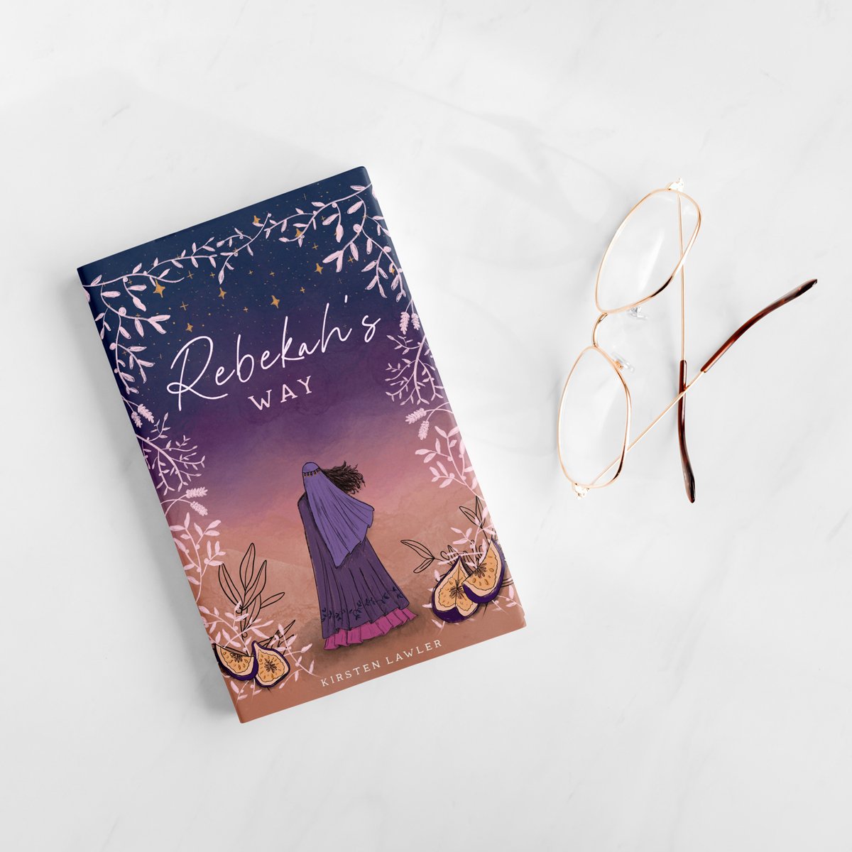
Explanation for text above: Truly, this setting/scene is the perfect embodiment of the book, and Rebekah’s journey. Throughout her story in the Bible, you’ll find that the biggest decisions she makes and the changes she undergoes happen at dusk/twilight/evening. Additionally, stars are mentioned throughout the book, and play a pretty integral role in the final chapter/page. So, I felt that this scene above might make for a beautiful illustration. My original and completely unartistic thoughts were > Include a lightly trod pathway between the fires and throughout the sandy evening landscape (stars overhead), with just a rough outline of the back of her as she walks ahead, alone, toward a small city in the far distance? This may be WAY too detailed, or not detailed enough. I truly have no expectations here, as I’ve never created a book cover. Which brings me to…
The goal: a beautiful, classic cover that people like you and me want to see on our shelves and coffee tables. That’s it.
2) Colors that came to mind when I wrote the story: dusky shades, like purples, lavenders, pinks, oranges, soft yellow (sand). Again, the cover can be colorful, or neutral with splashes of color. Go with whatever feels right to you!”
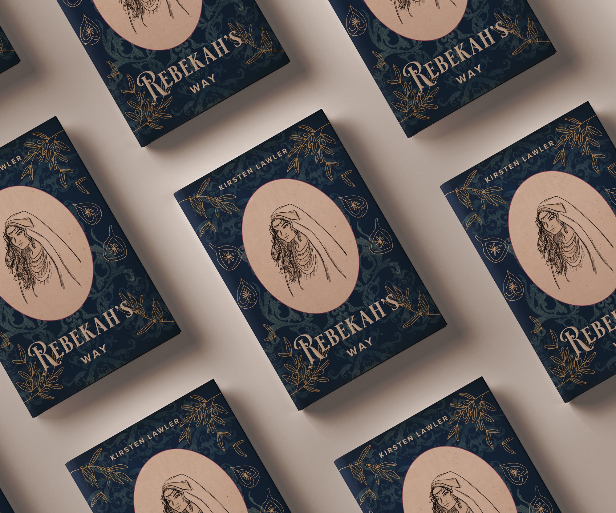
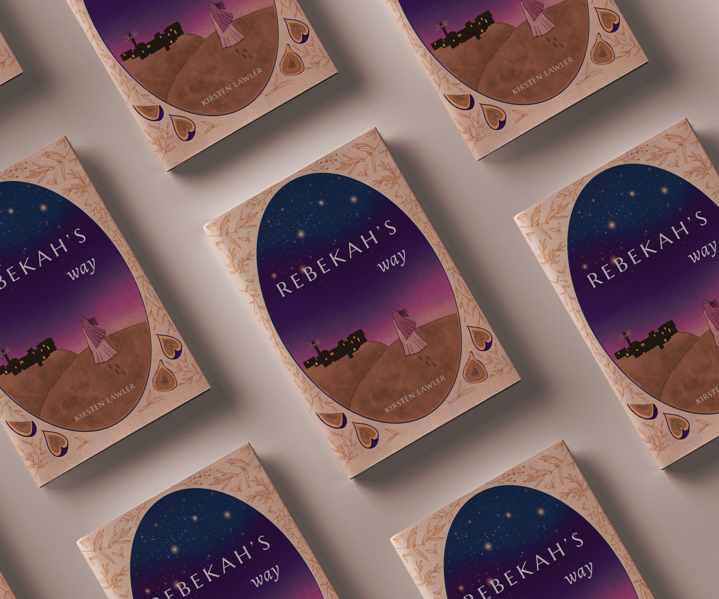
This creative brief was inspiring and exciting, and I immediately got to work. Here are a few early concepts!
After a few hits & misses, the final cover was approved and the spread work began! With my layout experience from working on the creative team at a yarn company (where we published knitting patterns regularly), I offered to help Kirsten lay out the cover spread as well, and this was the final spread and cover!
Kirsten was extremely happy with how this cover turned out, and was kind enough to write these words:
“[Melody] took my dreams and ideas and illustrated them (by hand, no less) into reality. Every inch of the cover art was done by her—I gave her full creative liberty, and I am so happy I did. If you’re looking for an incredible cover artist who specializes in hand-drawn, completely unique elements, look no further than Melody. ”
Find Rebekah’s Way on Amazon! I recommend the paperback if you want to truly experience the cover and the story, but Kindle works too ;) Happy reading!


