Alway Services
Let me honest and tell you that I really never expected to be able to design for Kirsten of Alway Services.
"She's got it all together," I told myself while laughing at her Instagram stories and saving every one of her posts, before finally hiring her to help me strategize my Instagram. At the end of our strategy call, she asked if I would design a new brand for her. Um, DREAM!
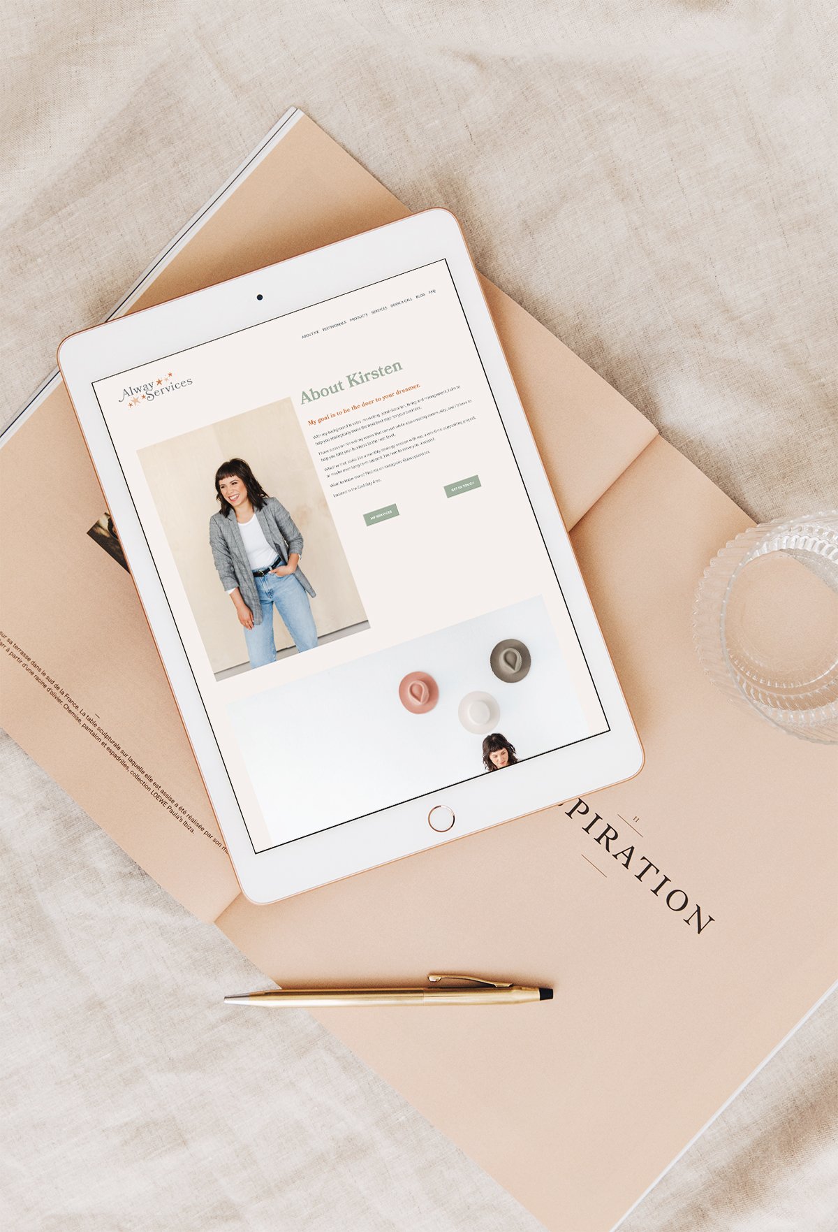
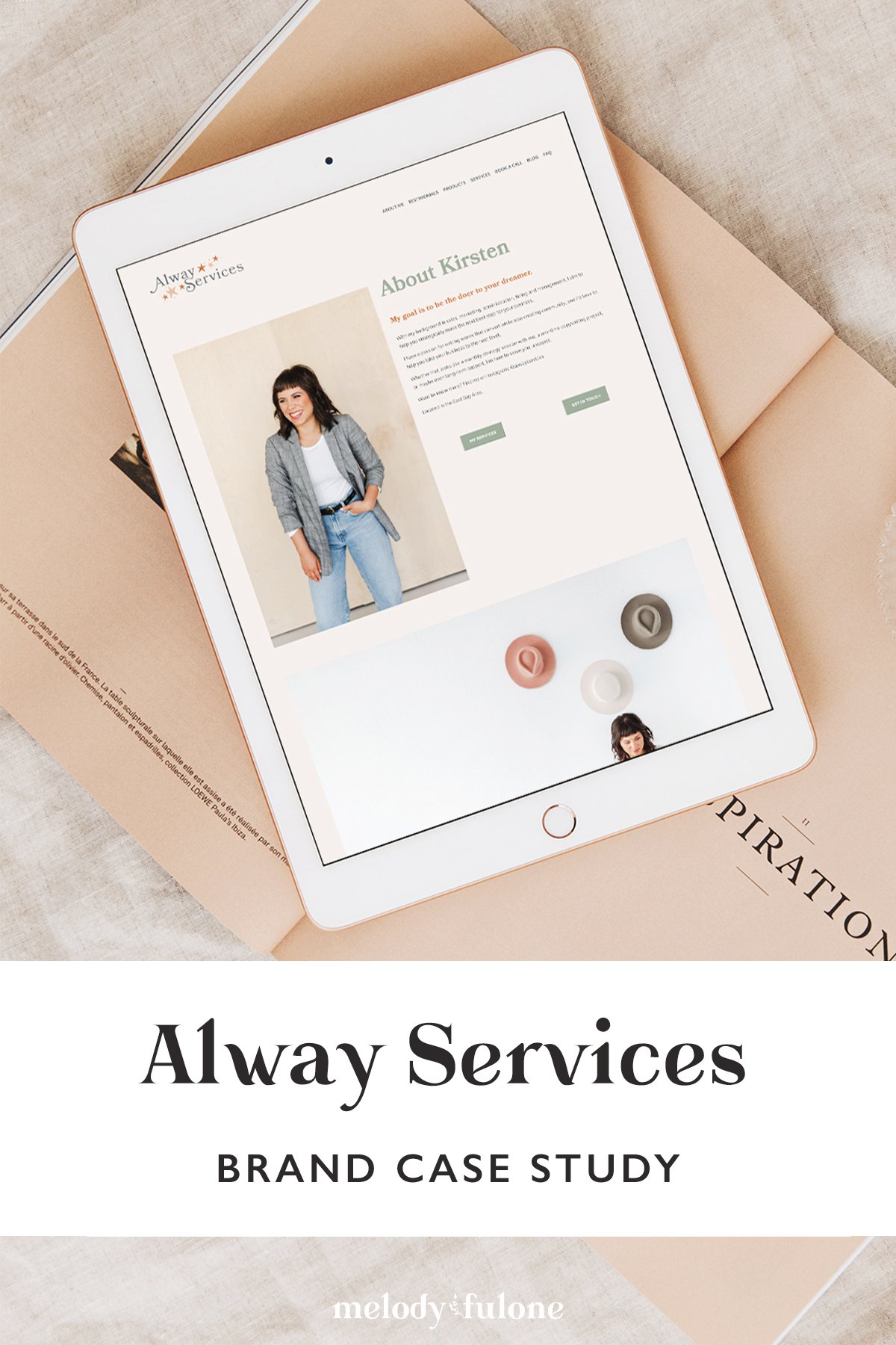
The entire design experience was so much fun - from the hand-drawn elements to the bold fonts to the welcoming website. I wanted Kirsten's brand to reflect her vision for her business - to feel approachable, helpful, and exciting for someone like me, one of her target clients. She is utterly helpful, extremely reassuring, and just the kind of person you want on your side to help you work through the daily stresses of running your own business.
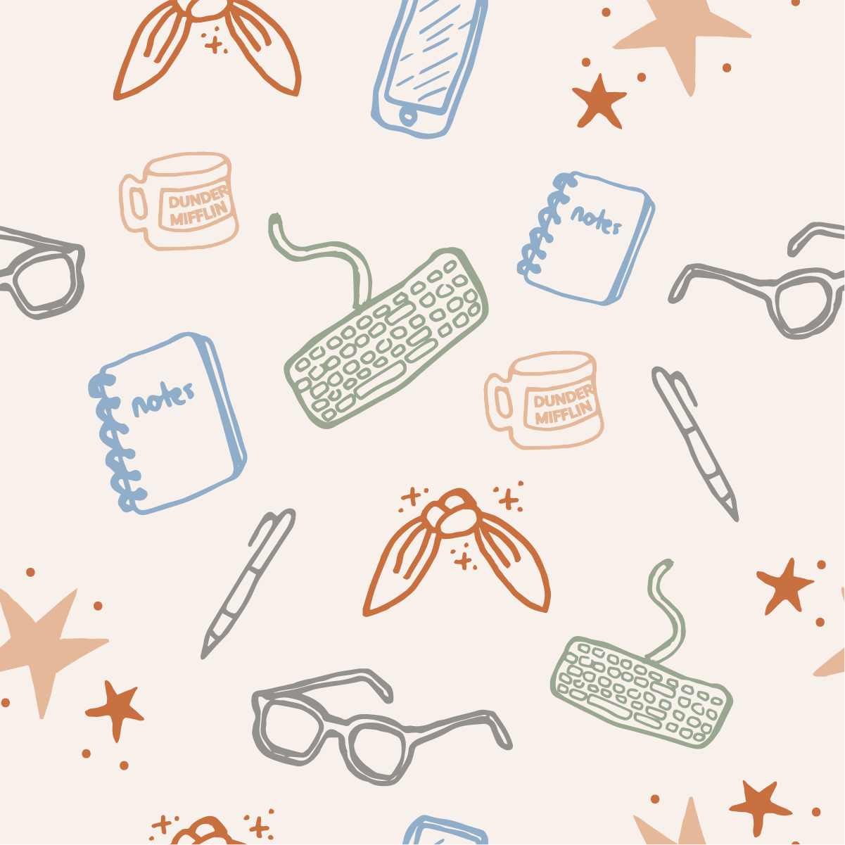
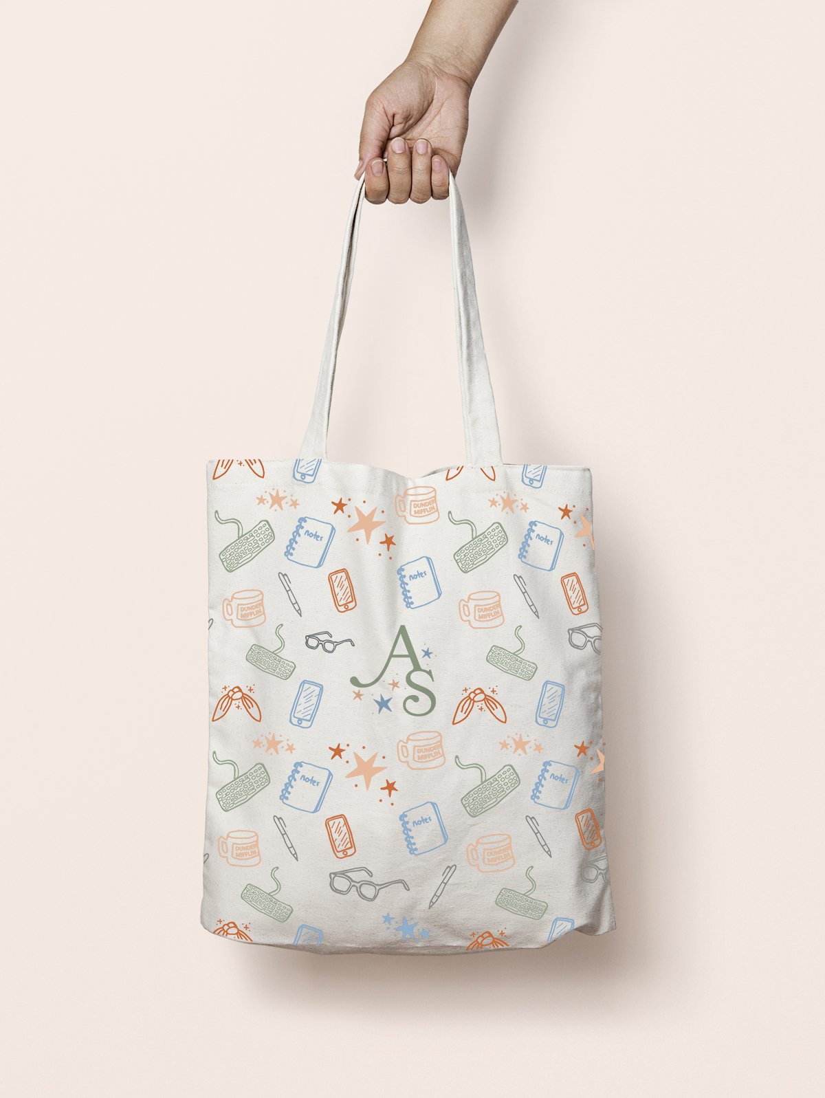
For her palette, we were working with a few existing colors as well as adding in a few more. I rounded her sage green with a denim blue and some warmer tones, and used them throughout her brand illustrations and patterns.
Oh, did I not mention her brand illustrations? Kirsten is a massive fan of The Office, so I was inspired to include a few nods throughout her brand marks, as well as include some magic.
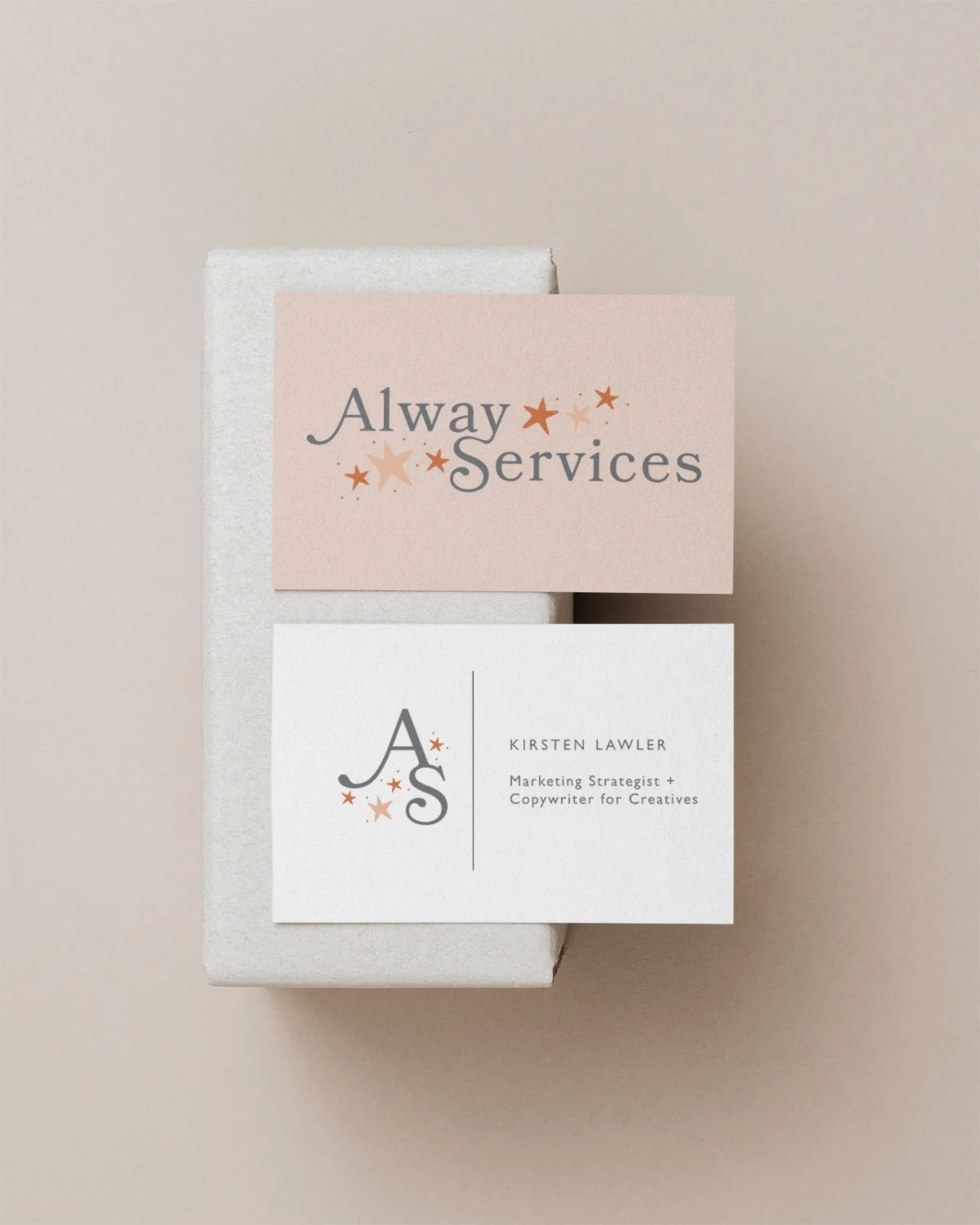
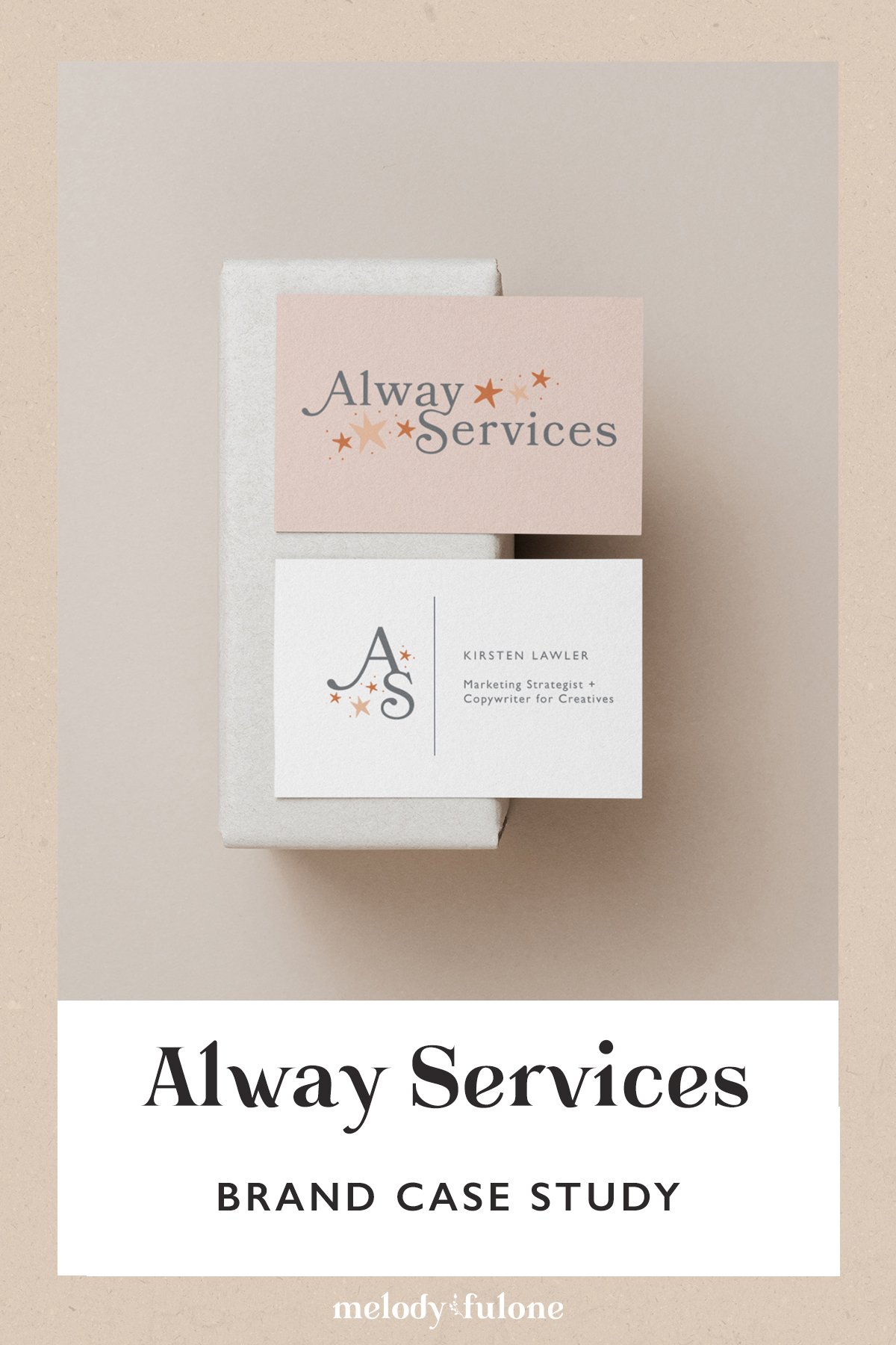
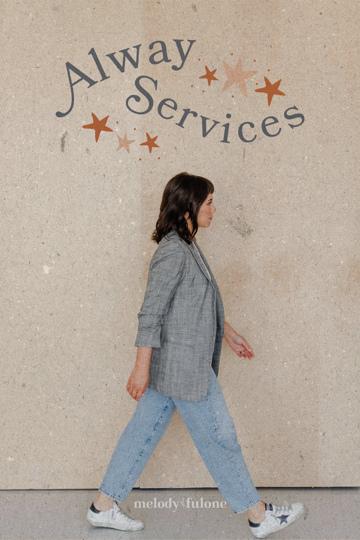
I really can’t say much more about this brand, except that it was one of those creative processes that flowed super well. I wanted to create a logo that would appeal to me, as part of Kirsten’s target market, and I was drawn to movement and curvatures. Her logo pretty much designed itself after that.


