How to Put Your Brand Design to Work
So you’ve got a new brand design from your graphic designer, with a whole branding package! This package probably includes a brand new logo, a submark or monogram, a fresh color palette, some brand elements, and sweet fonts. You even got a style guide that tells you exactly what each part of your brand package should be used for! Putting this package to work for you is the fun part, so let’s get started!
Logos
Your designer most likely provided you with several different file formats for your main logo, including a web size one. Start uploading your logo to your website, and play around with different sizes to see which works better. Does your website heavily rely on color and images? Try using the black-and-white version of your logo for a modern pop! I always recommend the PNG file for any web graphics.
Next, make sure to change out your favicon! That’s the little symbol that sits in the left-hand corner of each tab of your web browser, and it changes depending on what website you’re on. Your designer most likely provided you with one, but in the event they didn’t, you can resize your submark to 50px wide to be the favicon. Most website providers give you the option to change out the favicon, so get uploading!
After that, it’s time to update your social media profile images! Depending on your type of business, you may want to stick with that gorgeous photo you have of your smiling face, but if you need to, a monogram version of your logo should work just as well.
Any special elements that your designer made for you (such as little illustrations or drawings) may be used for website detailing, Instagram highlight covers, Facebook service photos, and more!
Colors
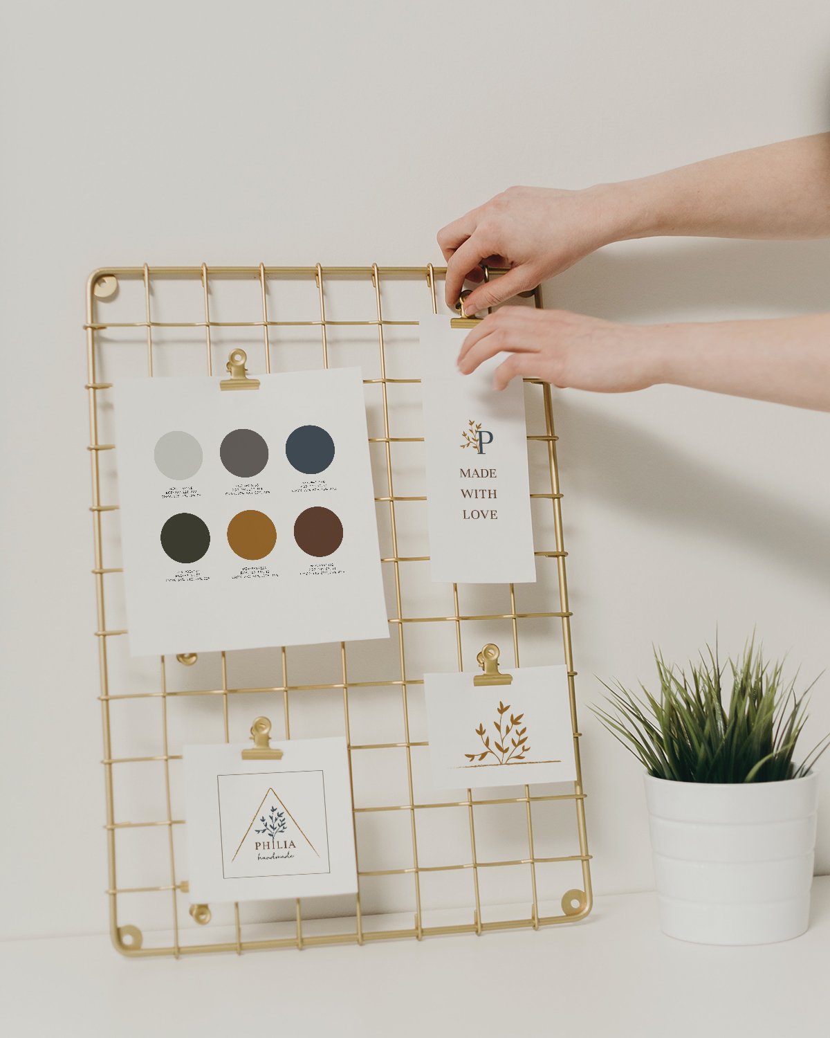
Next up, your colors! Every brand should include 3 or more colors in its palette, and these usually range from light to dark. The darkest shades should be used for body or paragraph text, as it will be the easiest to read. The medium colors can be used for headings and subheadings - because the text is larger for these, it’s okay to use a lighter color. The lightest and/or brightest colors in the palette should only be used for details, such as lines or spacers, as they will add just the right pop of color to your materials without being difficult to see.
Illustrations & Brand Elements
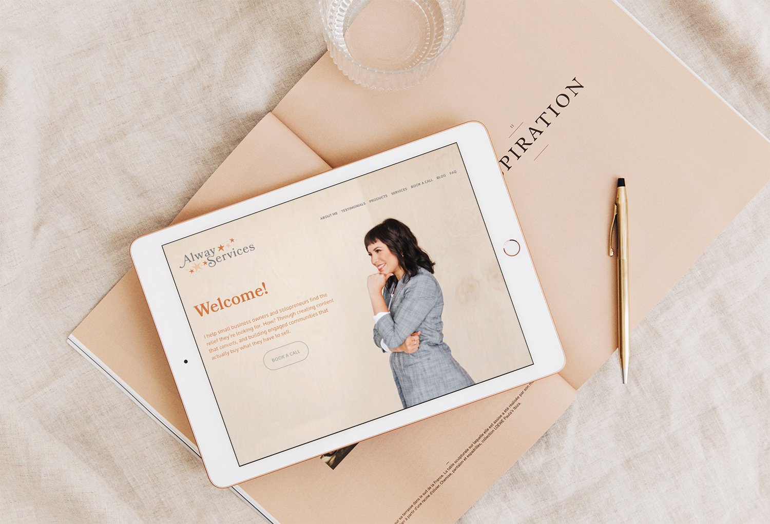
Sometimes a brand package will include illustrations or elements that can be used throughout your print and digital collateral to keep it on brand. For example, Hannah of Philia Handmade uses her vine illustrations on social media graphics and her ‘made with love’ care tags, while Kirsten of Alway Services sprinkles her star illustrations and signature text throughout her blog graphics and email signatures.
Typography
Your style guide most likely includes a section on your brand’s typography. A brand will usually include 2-3 fonts for headings, subheadings, and paragraph text. In the event that any typography included in the logo has been highly customized or stylized, alternative fonts will be suggested and resources on how to find them to use for your own website and materials.
I hope this helped you learn how to make your brand design work for you! Don’t have all of these components, or need to rethink what you do have? Take a look at my brand package offerings, and let’s talk!


